2020 exposed many of our societal issues and flaws. It separated people through social distancing but it also brought people together around social justice.
Over the past four years, marches and protests such as the Women's March, the Climate March, and Black Lives Matter protests have been used to demonstrate a collective dedication to justice whether that be social or environmental. These marches and protests allow people to find a community and, with one unified voice, tell our government that we want a better future. These marches are often extremely well planned and the people and groups that set them up have to find ways to get the word out: the more people that come, the more impactful the event is. However, as a participant of grassroots activism, I have always found it hard to know exactly when and where these events are happening. I began to wonder if others felt the same way which led to a case study and a design idea called WeMarch.
WeMarch is a mobile app with the mission to provide a platform that more effectively informs the public about grassroots events that are happening in their area. The intent is to provide a platform where people can hear about grassroots events that are happening from trusted and legitimate groups and to provide a platform that will provide a comprehensive explanation of events happening in their area.
Within this post I will break down my design process in the creation of WeMarch.
Roles:
User Research
UX Design
Visual Design
Branding & Identity
Prototyping & Testing
Deliverables:
User Surveys
Personas
Competitive Analysis
User Stories & Flows
Branding & Identity
Visual Design
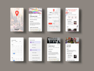
Wireframes
User Testing & Analysis
Tools:
Google Suite
Figma
InVision Studio
Usabilty Hub
I started by conducting both user surveys and user interviews. My user survey was completed by over 20 participants from all over the world. The survey asked them questions about their willingness to participate in grassroots events, their current and preferred ways to participate in grassroots events as well as issues they are the most passionate about. It also asked questions about the applications they use (if any), and their preferences and usage of these apps as well as their pain points.
From my user survey I collected very important user data. I found out that 95% of participants would be willing to go to a grassroots event, 68% have participated in events before and in terms of how participants find out about events in their area, the most popular answers included word of mouth (94%), Instagram (47%), Grassroots website (42%), and Facebook (36%). Some surprising answers to this question included Telegram app and seeing people already out on the street.
After analyzing the user data further I was able to deduce that this is a desire to participate in grassroot events for a wide variety of causes. The problem lies in the accessibility of the information for these types of events. The data showed me that there are too many unreliable places to search for this information and when it is found it is incomplete. Also, there are platforms that house this type of information but these also house a lot of other types of information so grassroots events can get lost or never seen by users. I was able to conclude that there needs to be an event specific, cause and location searchable, mobile platform for legitimate and reputable groups to post important, accurate, and complete information about their events. This needs to be mobile because the majority or users said that their primary browsing device is a phone. Also, grassroots events should be able to be accessed on the go.
In order to understand the strengths and weaknesses of other apps that users listed as well as find the market opportunity for my mobile application, I conducted a competitive analysis of Facebook and NextDoor application.
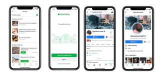
Both of these applications were created with the purpose of connecting people. NextDoor was created with the purpose of connecting users within local communities to each other and local businesses. Facebook is now known for connecting incredibly large groups of people internationally. However, both apps have aspects that can lead to mistrust from users. NextDoor for example, has been accused of marginalizing groups due to the fact that you have to have a verified address in order to use it. Also, there have been reports of racial profiling and hate messaging over the NextDoor platform. Facebook is infamous for privacy and cybercrime issues as well as allowing violent and unreliable information on its platform. In terms of the question of grassroots activism, both apps allow the spreading of information about events that could potentially include grassroots events. However, neither app is created for this purpose specifically and therefore this information can be lost or never seen by users. For example, with NextDoor only events that individuals feel is important to share, gets shared. If individuals within a neighborhood do not know or do not care about a grassroots event, they will not post about it. For Facebook, there are areas for grassroots groups to post information about events but users question their legitimacy or the information gets lost within the more expansive and busy platform.
A new competitor entering this market with the goal of informing users about grassroots events would have to create a platform that was simple to use and focused solely on the grassroots groups and events. It would also have to find a way to create trust among users: for example, there would have to be a vetting process for the groups involved. The information shared within this app would also need to be comprehensive and complete as users identified a lack of information about events as a frustration.
My research uncovered very helpful information about the current market and potential users. I used this information to create personas that would portray the different types of users that emerged from my research.
When creating these personas I faced the challenge of creating a user that was a person of color because I am not a person of color. I wanted to be thoughtful about this creation and be aware that any part of this persona that I was creating could come from an assumption since I have never lived the life of a person of color in this country. I wanted to make sure I was staying true to the mission of helping social justice causes with this design process. One adjustment I made was removing the "favorite brands" section of my persona template. It did not seem like relevant or helpful information for this particular project.
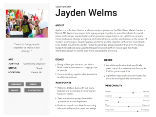
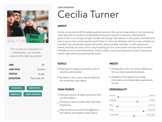
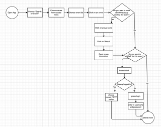
The research I conducted helped me gain a better understanding of my users and of which features of are of highest priority. Keeping these personas in mind, I compiled a list of user stories for new users, returning users, and administrative users to reach the minimum viable product .I used the user stories to develop user flows to map out the highest priority user stories. Creating the user flows helped me think critically about the most intuitive paths that users would take to accomplish each task.
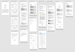
I used the more in-depth understanding of my application from the creation of my user flows to start sketching out the interface as well as create low fidelity wireframes. I incorporated the highest priority features in my wireframes.
After creating my wireframes, I was still left with a lot of design questions that I did not quite have the answers to:
1. How do I keep the interface as simple and user friendly as possible?
2. Should there be some sort of event sharing mechanism? How could this work without connecting to an outside platform?
3. Does asking for an email address to login in/ create an account marginalize people?
4. How do I create a list of events that has all the information needed without everything being too cluttered or too small?
I discussed these questions with a design mentor I have and conducted 3 short usability tests. Through this, I discovered that my interface was user friendly and the flow was clear. I also discovered a way to make sure that all user could use my app without being marginalized: create a "search incognito feature". The idea behind this is that any user can use the app for the search features without having an account. Having an account would give the user access to other features such as saved events and articles. I believe that this is important because this allows people to feel as if they can trust the application. It is important for people to feel as if they can participate in these grassroots events without their information being used as a target of a hate crime. I also decided that for the purpose of this application to work smoothly, I would not include any sharing features or connections to other platforms/ apps in my MVP.
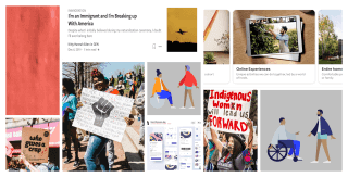
Now that I had a better understanding of the purpose, flow, and layout of my application, I began working on the vibe and feel. I started with one of my favorite visual design inspiration tactics: a moodboard.
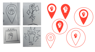
I used sketching and preference testing to design and decide upon a logo for WeMarch. In the end, a classic symbol met an empowering color that also emphasized the urgency of the movement.
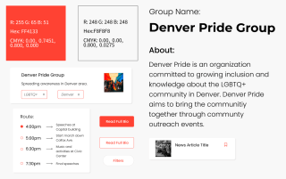
I deliberately chose Poppins as my one and only font for this application for many reasons. The first being that I want my app to feel accessible and simple. I do not want any particular design features distracting from the main mission of the app which to help people find out about grassroots events in their area. Poppins has high readability and legibility. It is an accessible font for all which speaks to the mission and vibe of inclusion that I am hoping this app will convey. Also, in studying current design trends it seems that mobile application are moving in the same direction as this app in terms of using an all sans-serif fonts like Poppins. I chose not to pair this font with another font because Poppins is, in itself, a very versatile font with many different available weights and styles. It will be easy to create clear hierarchy throughout the interface without having to pair it with any other font. I also feel that Poppins works exceptionally well for lists and titles which will be the majority of the interface for this application.
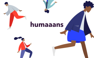
You will also notice that I chose to incorporate the illustration set, Humaaans into the design. I did this because these illustrations capture many groups that have traditionally been left out in design and technology. These illustrations are beautiful and just help give a more inclusive, friendly vibe.
During this design process, I set out to create the visual design for a mobile application more effectively informs the public about grassroots events that are happening in their area. The intent of WeMarch is to provide a platform where people can hear about grassroots events that are happening from trusted and legitimate groups and to provide a platform that will provide a comprehensive explanation of events happening in their area. I hope to continue getting feedback on this design and maybe even one day more it a reality. More though, I hope that we as a country find ways to fully embrace inclusivity, social justice, and environmental justice into our culture and make a better future for ourselves and the next generation. Thank you for reading about my design process.