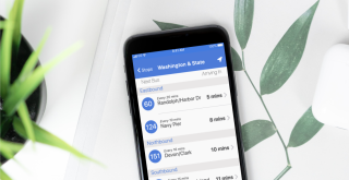

"Travelers can now relax and confidently enjoy their trip."
A public transit application that creates a smoother, more positive, and more efficient journey.
The scenario for this application is a large city transit system that recently underwent an expansion. This expansion has led to the addition of many new bus routes. While expansions can definitely lead to benefits, they can also lead to added complexity for the users. In this case, users were specifically complaining about stops that serve multiple bus lines.
Picture this for a second: You are a user of this public transit system. You are walking towards your regular bus stop from which you commute to work. You are about a block away when you see a bus pull up. You hold your bag tight and run to the bus stop only to find out that… it is not your bus. This situation can be easily avoided with a mobile app that reliably and accurately gives the users information about the bus stops in this city transit system.
Questions addressed by the app:
Which bus line is arriving next?
When will it arrive?
How long does the user have to get to that stop?
Roles:
User Research
UX Design
Visual Design
Usability Testing
Development
Deliverables:
User Surveys
Personas
Competitive Analysis
User Stories
Paper Prototype
Visual Design
Prototypes
Analysis
Tools:
Google Suite
Figma
Atom
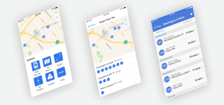
Public transit application are an integral part of the public transit system today. BusyBus allows users to more efficiently plan, not only their transit journeys, but their whole days by removing the ambiguity and confusion of when buses will arrive and at which bus stop locations. Users can look at specific stops and find out how long it will take them to get to that stop and which buses will be arriving there at specific times.
I started by conducting both user surveys and user interviews. My user survey was completed by over 30 participants from all over the world. The survey asked them questions about their public transportation usage, their current and preferred ways to navigate their public transit systems, the applications they use (if any), and their preferences and usage of these apps as well as their pain points.I also chose 2 participants from the survey to interview.
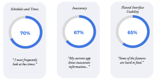
From the survey and interviews, I discovered that 70% of users feel that the most important feature on a public transit app is access to s chedule and times, 67% of users feel that there are aspects of inaccuracy in the current apps they use, and 65% of users feel that their apps are in some way not user friendly.
My most surprising discovery was that many people, though they may want to try a locally or regionally specific application, many switch to Google apps because other apps externalize information in the sense that different features have to be viewed in a different window, on a different website, or even in a completely different application.
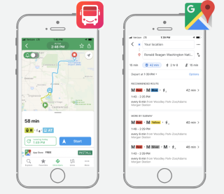
In order to understand the strengths and weaknesses of other public transit apps as well as find the market opportunity for my BusyBus app, I completed a SWOT competitive analysis of Google Maps and RTD Denver. From the SWOT analysis, I found...
The RTD app provides system maps and station information specific to Denver that Google Maps does not provide. However, this app’s weaknesses include an interface that is busy and confusing to navigate. RTD Denver also often provides inaccurate schedule and time information.
Google Maps is globally known as a reliable navigation app for multiple modes of transportation including cars, buses, bikes, walking etc. Google maps is also known for its accuracy and reliability in terms of journey times and distances. However, the weakness of Google Maps in this situation is that it does not provide bus stop specific information which is what was specifically asked for by users in this case study design brief.
I discovered that the opportunity for my BusyBus app would be a locally specific, reliable and accurate transit app where users can find everything they need in one app. The BusyBus user interface would also need to be easy to be intuitive and easy to use in order to stay competitive in the category of transit applications.
My research uncovered very helpful information about the current market and potential users. I used this information to create personas that would portray the different types of users that emerged from my research.
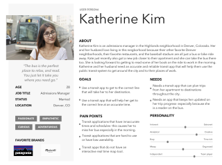
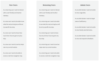
The research I conducted helped me gain a better understanding of my users and of which features of a public transit applications are of highest priority. Keeping these personas in mind, I compiled a list of user stories for new users, returning users, and administrative users to reach the minimum viable product.
Highest priority features included:
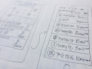
I used the more in-depth understanding of my application from the creation of my user flows to start sketching out the interface. I incorporated the highest priority features in my sketches and completed multiple iterations of these sketches. I also conducted 5 short usability tests using my initial sketches.
From the usability testing, I gathered three main important takeaways:
1. Participants reported feeling that app was user friendly.
2. Not all participants knew that the map was interactive.
3. Participants were unsure where back buttons were leading to.
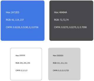
I used colors to communicate and colors that would not conflict or distract from one another. I chose to use a blue to show when specific items or icons were clickable as well as to show connections between items chosen and new pages. I kept my color palette consistent throughout the different screens from the button colors, information colors, and background colors. I also made sure to avoid using colors that make it hard for people to perceive the content.
Finally, I made sure, using the Contrast app from Apple, that my contrast ratios received an AA or AAA rating so that my app would provide optimal legibility for all users.
I used the typography guidelines outlined within the iOS resources created for Figma and cross referenced my choices with the Apple Human Interface Guidelines. I stuck to SF Pro Text or SF Pro Display for any text within my prototype. I used these fonts because the interface guidelines discussed how they can be used in a flexible manner at different sizes and weights while still maintaining legibility. I also used different sizes and weights to establish hierarchy of information. For example, I used font size 20 and bold style for titles. I also minimized the number of typefaces I used as per recommendation by the guidelines
I integrated the feedback from the usabilty tests I conducted with my sketches and the visual work I did into the creation of a clickable prototype in Figma. In order to address the issues brought up by the participants of the usability tests, I created clear labels for the back buttons, and made sure that the map design was created in a way that clearly showed interactive aspects. This was done by placing familiar icons such as location icons. In creating this clickable prototype I also followed the iOS Human Interface Guidelines to maintain consistency throughout my design.
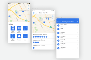
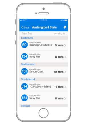
My final step in creating this application was to code the final prototype. I used my knowledge of HTML and CSS to create the third screen of the visual prototype which lists the busses that arrive at a specific bus stop.
For this final prototype, I was given more information that I needed to account for that I did not plan for in my original hi-fidelity mock-up design such as direction of travel, busses that were rerouted, and busses that were out of service. I made decisions in the creation of this final prototype so that it would maintain consistency with the visual design and the iOS human interface guidelines in terms of features such as space, typography, hierarchy, and color choice.
Due to the fact that I needed to incorporate more information than I had previously planned for, I also decided to add more labels that helped with organization of the information such as the labels “Next Bus” and “Arriving In”.
During the process I faced many new challenges from figuring out how to avoid “divitus” and properly organizing the semantics of my code to figuring out how to create inline displays and other CSS basics. T hough I overcame these challenges and was able to create a finished product, I know there is much more to learn and more ways that I can revise this work.
In the end, this final prototype is a solution for the problem of a transit system expansion that has led to a complexity of usage for the users of the transit system. This final product provides a simple, organized, and accurate way for riders to know what the next arriving bus us, when it will be there, and how long they have to get to the bus stop.
• I learned the importance of understanding a companies design system and adhere to their brand guidelines to maintain consistency. In fact, I learned the value of maintaining consistency across a design. I will use this knowledge in future projects and when creating my own design systems.
• I learned how more effectively implement user research in a way in which my designer bias does not impair my ability to fully understand the user’s needs.
I’m currently taking on new clients for freelance work.
Get in touch if you’d like to collaborate on projects or just want to chat about web design!