

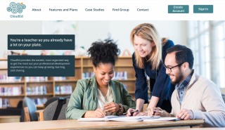
"We know that teachers are busy, we just want to make their lives a little easier."
A cloud storage and organization platform created to help educators more effectively continue their cycle of learning, growing, and leading.
There is much room for improvement in the world of cloud storage tools made specifically for educators and educational purposes. Often, educators must rely on tools that were made for other purposes instead of platforms that meet their specific needs. The CloudEd application addresses this issue by providing an application specifically made to support the professional development of educators. This platform was created with a brand identity that encompasses the mission of helping educators more efficiently participate in the cycle of learning, growing, and implementing in the most productive way possible.
Duration: 6 weeks
Roles:
User Research
UX Design
Visual Design
Branding & Identity
Prototyping & Testing
Deliverables:
User Surveys
Personas
Competitive Analysis
User Stories & Flows
Branding & Identity
Visual Design
Wireframes
User Testing & Analysis
Tools:
Google Suite
Figma
Sketch
Adobe XD
InVision Studio
Usabilty Hub
For this project, the client outlined the desire to explore the possibilities within the cloud storage and organization application market. The challenge to tackle was that, though there are already many big names within the cloud storage market, the market is still young and there is plenty of room for another platform as long as it has the right combination of in-demand features and targets a specific audience.
Underserved audience with a need for a cloud storage application specifically tailored to them.
Educators go to many professional development experiences each year from after school, on campus meetings to nationally run conferences. At these workshops they are always given resources to help them continue their learning and implement what they have learned. However, these are often received in paper form or in Google Drive. An educator may not necessarily implement that specific idea or skill until months later and at that point the resource is hard to retrieve and the opportunity for growth is ended or becomes too time consuming or difficult for a teacher’s already packed schedule.
CloudEd cloud storage and organization platform makes valuable resources accessible and allows teachers to continue as professionals and grow in the art and science of teaching.
Through CloudEd, educators can also stay connected to other members of the development experience for collaboration and to grow a community of support.
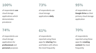
I started my process by conducting user surveys to better understand which platforms were being used, what features users value and use frequently, and their pain points.
In connecting this back to the requests within the client brief, I was able to see that the client was correct in stating that sharing, uploading, creating and organizing content are all valuable and important features for users (as well as connecting with others) while saving content from the web was not a valued feature. This would help me in deciding which features to focus on.
To both understand the cloud storage market and to understand how to best position my cloud application ideas I conducted a competitive analysis of Google Drive, Pinterest, and Evernote. I chose these three applications because they are all applications that my survey respondents indicated that they use and they are distinct from one another in what they offer users. Evernote is a place for note taking, journaling, and organizing, Pinterest a place to browse for ideas and inspiration, and Google Drive is an all in one storage platform that is well known for expanding the abilities of real time collaboration.
Google Drive’s biggest weaknesses include a cluttered interface with an unreliable search functionality.
Pinterest has issues with scams and spam as well as a perceived gender bias market.
Evernote has an interface that is not intuitive and pricey upgrades.
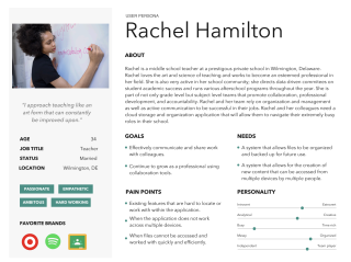
My research uncovered very helpful information about the current market and potential users. I used this information to create personas that would portray the different types of users that emerged from my research.
Their major distinctions lie in the potential use of the application for professional versus personal projects as well. Also, the family traveler persona has a stronger emphasis on documentation and creation of a narrative that will be created and then left alone while the teacher persona emphasizes an ongoing process of sharing, learning, and implementing the content found in the application.
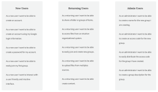
The research I conducted helped me gain a better understanding of my users and of which features of a cloud storage applications are of highest priority. Keeping these personas in mind, I compiled a list of user stories for new users, returning users, and administrative users to reach the minimum viable product.
Highest priority features included:
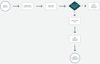
I used the user stories to develop user flows to map out the highest priority user stories. Creating the user flows helped me think critically about the most intuitive paths that users would take to accomplish each task.
I used the more in-depth understanding of my application from the creation of my user flows to start sketching out the interface. I incorporated the highest priority features in my sketches and completed multiple iterations of these sketches.
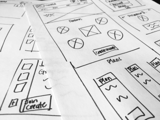
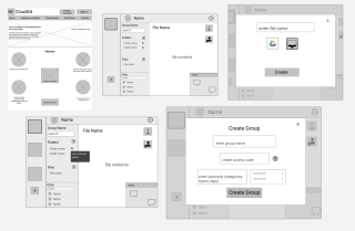
From these sketches, I created my first iteration of low fidelity wireframes. For these, I created two different designs for the interface to show users in a usability test. These designs had the same purpose but in very different layouts. Within these wireframes, I mapped out the onboarding process as well as creating and joining groups, uploading content, sharing content, and connecting with other group members. For both designs, I conducted both in person and remote usability tests and had the users complete 7 different tasks. It was an overall positive experience.
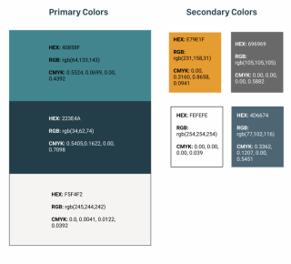
My primary color choice involves a greenish blue, dark blue, and offwhite as the primary colors while having an ocher yellow and grayish blue as secondary colors. The greenish blue was chosen to combine the meaning of both blue and geen. Green signifies growth and development and brings energy with it. Blue signifies wisdom and learning and is calming. A blue-green combines the strengths of these colors. The darker blues ground the design and emphasizes the professionalism aspect of the brand. The ocher yellow adds energy and positivity to the platform. I also made sure, using the Contrast app from Apple, that my contrast ratios received an AA or AAA rating so that my app would provide optimal legibility for all users.
For this project I chose the font pairings of SF Compact Display Typeface and Open Sans Typeface. These font pairings convey the message of professionalism and harmonize with my refined logo design, which I will discuss briefly. The combination of Open Sans and SF Compact Display are a nice sans serif combination. The humanist quality of the open sans contrasts well with the more geometric nature of the modern SF Compact Display. Both work well together because of the fact they both have high legibility characters in their letterforms.
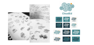
Through the process of setting the tone of the brand I also created a logo. I started brainstorming the logo with mind mapping and sketches. My final logo design was centered around a spiral shape because of the meaning behind a spiral. The spirals signify growth and development, a group of them shows collaboration. The final shape of the cloud signifies the cloud storage and organization capabilities of this program. However, the cloud also signifies another meaning- this program allows for a way to organize and keep track of resources in a simple way. It is what you need when your head is clouded by clutter and messiness. The ellipse signifies balance and positivity. It is balanced between two of the spirals and the yellow shade brings energy to the logo.
I took the work I did with the functionality of the platform and combined it with the branding identity work to create my first hi-fidelity mockups. In order to make some important layout decisions, I conducted preference tests.
I turned my high fidelity static mockups into a clickable prototype using InVision and conducted 3 remote and in person usability tests.
I had the users complete a series of tasks and also asked them questions specific to the branding. These tasks included…
1. Creating an account
2. Joining and creating groups
3. Uploading and creating content
4. Sharing content
5. Connecting with other member
The branding questions included opinion questions about layout of the platform and feelings evoked by it.
Within this usability test round, I found it very helpful to video each of the tests so that I could go back and closely analyze the feedback I received.
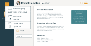
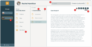
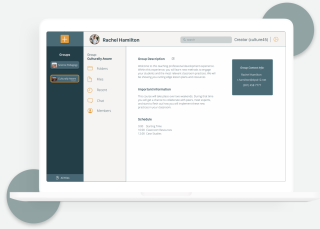
1: Users wanted a symbol indicating which groups they are the administrator of. This was resolved by adding the word “creator” within the group box that the user was the creator of.
2: Based on user confusion during the tests, it became clear that there needed to be a clearer indication of which folder the user is in.
3: I originally thought that, in order to perform an action for a specific folder, the user would start with the list of folders. Based on the way in which users accomplished the “add collaborator to folder” task, it became clear that I needed to provide an alternative way for users to complete these tasks. I added an ellipse icon that lead to a dropdown menu.
4: In order to streamline the interface look, I moved the placement of the search bar instead of having it in multiple places which caused confusion of what the user was searching for.
5: This was a simple change! According to user feedback, I added indicators of who is you have shared the file with/ who is collaborating on it by adding a picture icon.
6: After many usability tests and impromptu user interviews about icon meaning, I came to the conclusion that I would be unable to find icons that meant the same thing to every user. Instead, I added hover labels indicating the meaning of the button so that the purpose of each button is clear!
7: Based on user feedback, I added a place where user can see a list of other members.
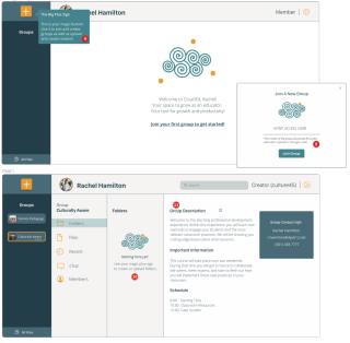
8: In order to make sure that one of the most fundamental actions in this application was not confusing, I added access code subtext so that users would know where they can find the access code for a group they want to join.
9: Based on my observations of users’ initial navigation through the application interface, I realized that it would be easier for the user to understand the purpose of the context specific plus sign if I added a short tour to make the big plus sign more clear from the very beginning!
10: The context specific button is one of the most important features of the application. I added further hints of how to use the context specific plus sign when a user is first setting up their dashboard.
11: Number twelve was a lesson in CONSISTENCY! I had originally labeled the group description as “course description”. User feedback that this inconsistency in labeling was confusing, “Were they part of a course or a group?”
This process all led to the final prototype.
This final prototype is a solution to the initial problems outlined in the client brief. It is a cloud storage application that can be distinct within the cloud storage application market and targets a specific audience that has been under-represented within this market.
Based on the features desired by both the client and the users, this application allows people to share content, upload content, back up content, organize content, and continue communicating and collaborating with others.
CloudEd makes being a part of a professional development experience more organized. This is important for educators who have already extremely busy lives and so much to keep track of. With CloudEd you can easily join a professional development experience. All it takes is an access code provided by your instructor! When you are ready to lead, you can also create your own groups to share your knowledge with other educators. CloudEd makes it easy for users to keep important resources all in one, organized, searchable place. Users can upload relavant files and folders to any of their groups and then add collaborators to these files to continue their cycle of learning with other members of their education community. CloudEd makes it easy for users to stay connected with other members of the professional development experiences they were a part of. Users can use the chat feature of the app to continue working with a learning from other educators.
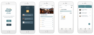
A high priority feature for users that emerged during the research phase was the ability to access the app across devices. Though I was creating an application that would be primarily used on laptop or desktop, I did not want to ignore this user need. I created a mobile app version for CloudEd. It is currently meant to be used for the purposes of viewing content within the groups the user is already a part of and joining new groups. It has the potential to evolve into an all encompassing app.
• I learned how much a project can evolve from the beginning to the end. It was amazing to see how much this project changed from the first iteration to the last.
• I learned the value of usability tests and how much a designer can learn from the perspective of a user, especially when they put their own perspective aside.
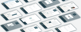
• It was imperative that I learned about project organization quickly as this larger project had many different deliverables and not to mention the sheer quantity of mockup pngs!
I’m currently taking on new clients for freelance work.
Get in touch if you’d like to collaborate on projects or just want to chat about web design!